Repairing America’s Jewelry
Background
M&G Jewelers repairs and services jewelry however, they aren't your average repair shop. Servicing national department store chains, major jewelry retailers and brand-name watch manufacturers, they service over 4000 retail locations nation-wide and process over half a million repairs a year. With success in the B2B industry, M&G wanted to expand their operations to B2C to provide direct-to-consumer repair and improvement services.
My Role
As Director of Design and User Experience, I architected the product experience from inception to launch, provided design direction, managed the entire UX process from branding, to copywriting, to design and engineering to ensure the product provided customers and clients with a mature, trustworthy solution to confidently bring to a new market.
The Challenge
Every market provides its own individual challenges, and within markets, there are particular nuances between B2B and B2C relationships that require their own attention and finesse. Although M&G had been servicing thousands of customers per year, it had very little customer data to go off of, as they were usually the private label, behind-the-scenes partner providing the excellent repair service for major big-box-retailers. Our small outfit of one designer, one copywriter, and myself were charged with the task of providing a customer framework that would be the building block for the initial service, as well as for future partnerships where big box retailers could also utilize the service. The product needed to be architected from the ground up.
The Approach
Business Requirements
Although our agency just completed their JEMS RMO Platform a few years prior, the JEMS Direct product would build on a completely new audience and approach. We outlined requirements from internal shipping, processing, and repair logistics, to physical UX touch-points (such as customer packing directions), to ecommerce considerations. It was imperative to outline all concepts so we were able to provide insight and recommendations on the best possible experience.
Stakeholder interviews
We conducted stakeholder interviews with M&G staff from the CEO, finance, operations, internal IT, and customer service to understand current operations, brand attitudes, and identify characteristics along the workflow that would need to be modified or reinforced for this new line of business.
Persona framework development
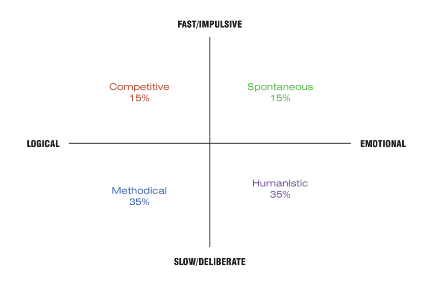
Because M&G did not have any B2C customers at the time, they had very little data to go off of in regards to customers. Although we lobbied for customer research initiatives, there were considerable constraints on budget and timeline, so I devised a framework based off of The Myers-Briggs Type Indicator (MBTI) assessment to create a decision matrix for projecting the paths of 4 different user types.
We also reviewed sample data from M&G’s current B2B repair traffic to analyze and segment the data into a median and range for the volume that fell within a given purchase price category. With this data we were able to draw a clearer understanding on the types of repairs that were being sent to M&G and yield insight to the current demographic and product volume that could be expected.
User Profiles
Based on the MBTI, we created user profiles that were used for the duration of the project to analyze workflows, interface components, and craft copy that was thought to be most effective for these profiles. The profiles outlined basic demographic data, story components to get in tune with that particular customer’s struggles and thoughts, as well as detailed concept data that provided context and goals to ensure the experience met the basic requirements for each customer type.
User workflows
We then assembled user workflows to outline micro and macro interactions to ensure entry points, exit positions, and the entire workflow in-between was considered. This became the foundation for wireframe templates and interactions that would eventually synthesize the application experience.
Interactive and functional prototyping
Once the general workflows were approved, I then utilized Axure to outline the application. From order flow, to customer account creation, to repair estimate approval, the entire experience was prototyped to give the stakeholders a start-to-finish view for the application. This became extremely important as the stakeholders were able to sort out any business gaps that may have been encountered as the experience would also be utilized by the multiple big-box retailers and needed to include proprietary warranty and pricing logic for each partner.
Design Brief
Although there were no formal branding initiatives, the design brief and strategy phases acted as mini-branding efforts as the JEMS Direct product had to stand apart from M&G’s other offerings. These documents defined the project concept, goals, design guidelines, business objectives, and value propositions.
Design Strategy
The design strategy process gathered intel on other competitors and provided recommendations for interface, visual, copywriting, and content strategy that drove the product development.
Copywriting
I sourced, contracted, and directed copywriting services for the product. This consisted of copy for the application experience, helper text, and all customer communication items such as confirmation, update, and estimate emails.
Design Prototype/User Interface Design
Providing the main design concept, I worked with our designer to fully detail the product and design all major templates, sub-pages, and all individual supporting items to ensure each detail was meticulously realized. We utilized the bootstrap framework as the html/css base and integrated the system into a proprietary .NET solution. Establishing a framework was important because a marketing site was quickly to follow and needed to be executed with the same consistency and finesse as the application experience.
Epilogue
JEMS Direct was a significant undertaking that spanned a 9-month period. It touched many tools in the UX and UI toolset and resulted in a solid product offering that enabled M&G to enter into an entirely new line of business utilizing their current workforce. A collective effort in managing a full stack team, vision, and outcome of the product that M&G loved and got behind.
The noblest pleasure is the joy of understanding.
Learnables
More (potential) customer and user time.
As a user experience professional with a background in psychology, building for people means you should get as much face time with them as possible. Although made the most of our approach based on constraints, the investment in customer research and validity testing would have made the offering stronger and potentially exposed any pertinent gaps in UX.
Always be future friendly
We pushed hard for a responsive solution, I felt very strongly that this should have been a part of the initial build but was not. To compensate, we chose a responsive framework from which we could build from in the future when they came around to choosing to elevate its importance. The conversation is currently gaining notice.
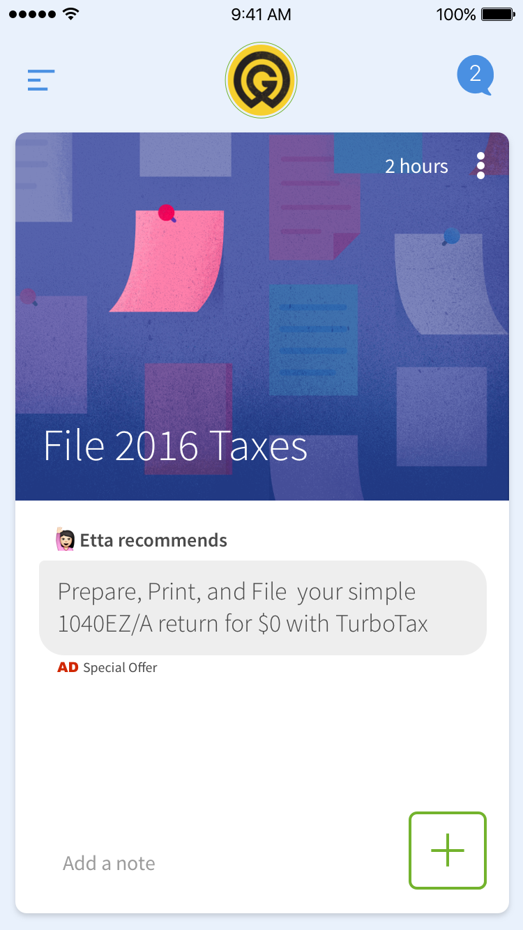
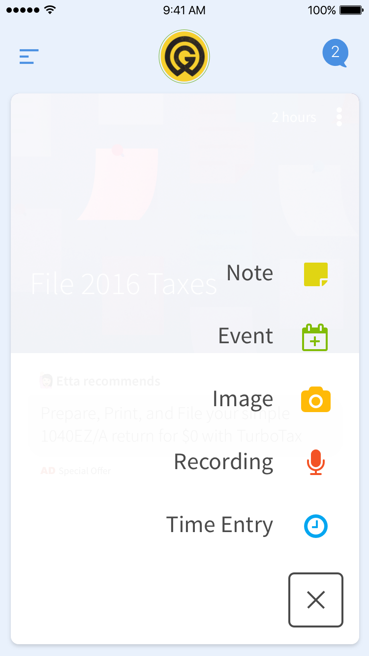
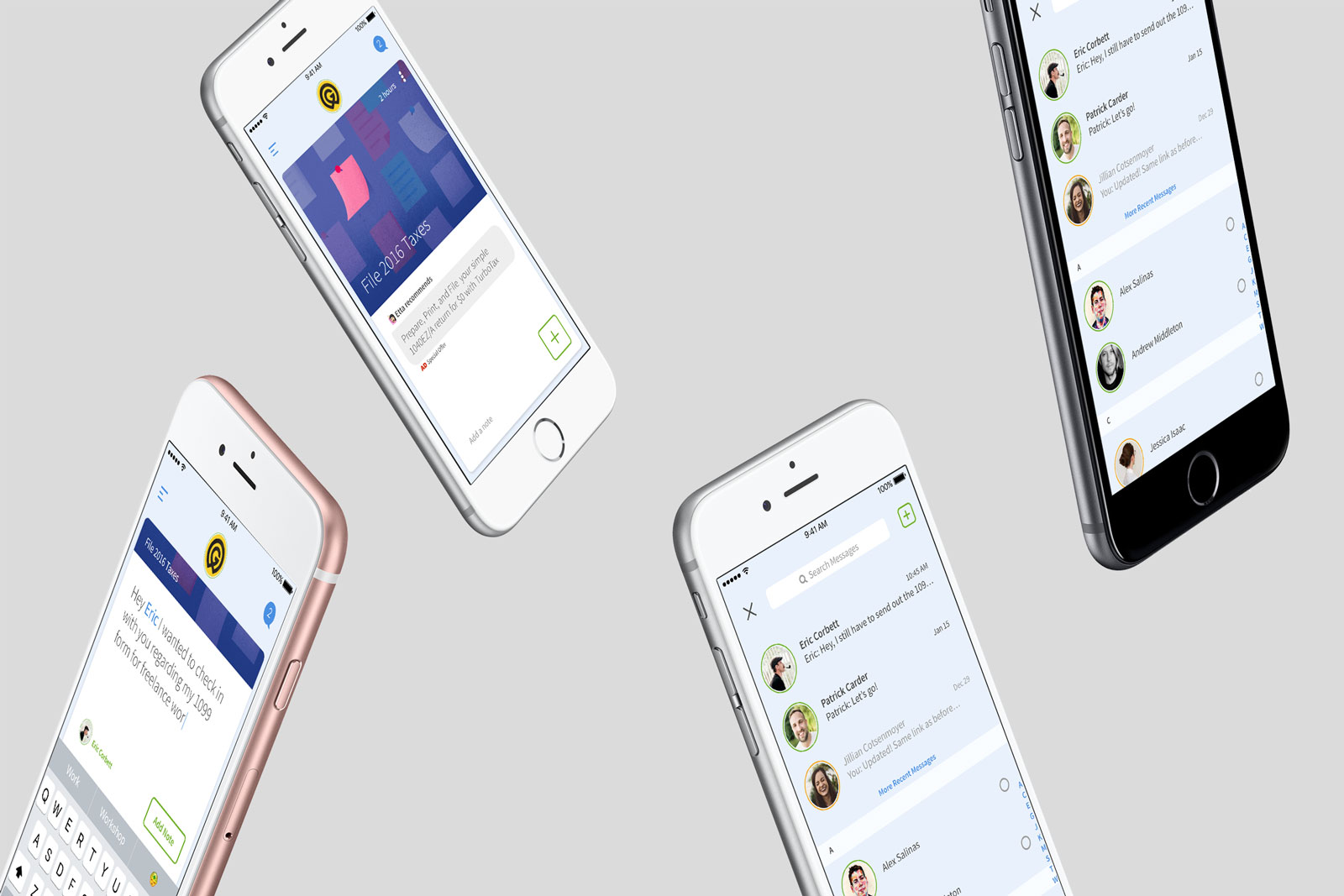
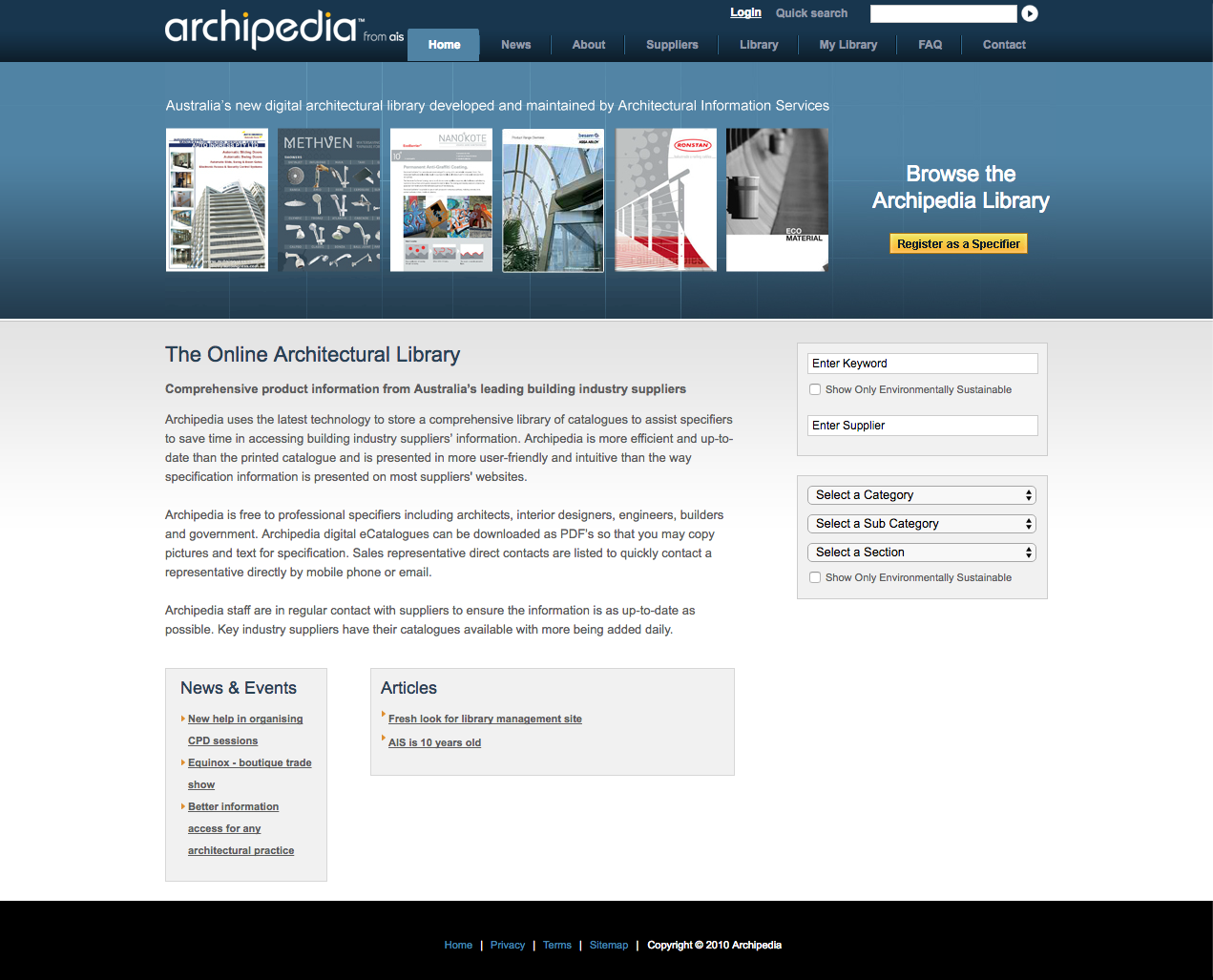
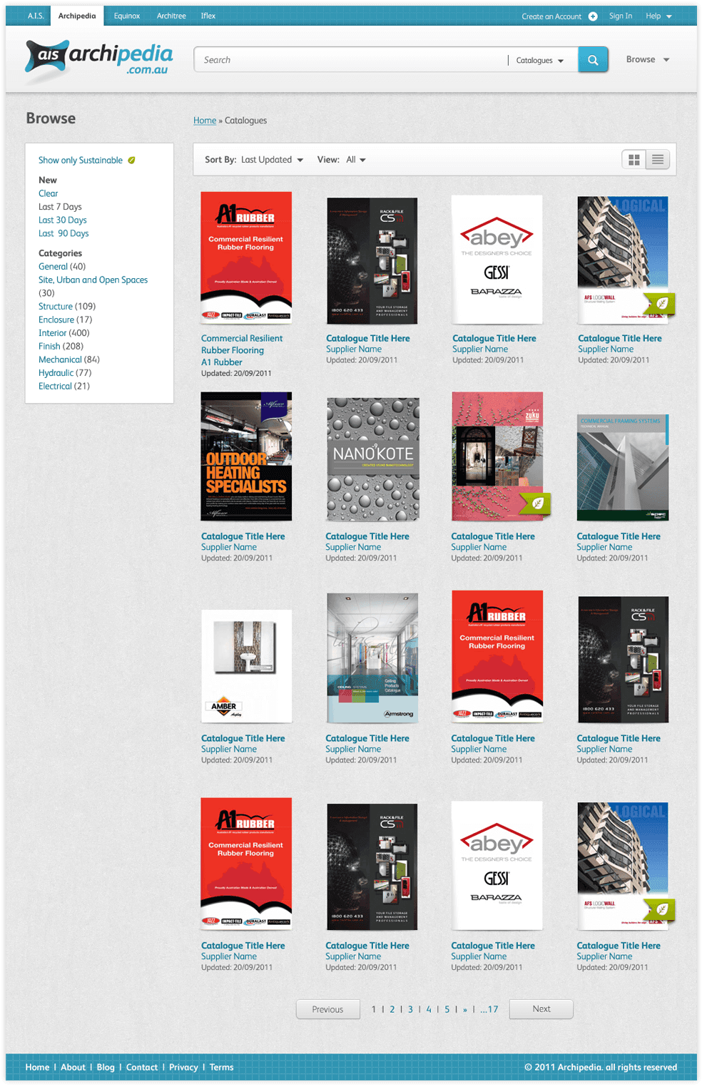
With only so much time in our lives it's important that we're spending our time on the things that matter, but with so many things vying for our attention, how do we decide what that is? This is the focal point for this product that's been in the making for almost 5 years. Utilizing a multi-factor algorithm, artificial intelligence aimed at improving user self-efficacy, and computational learning we've just completed our first phase prototype as an answer to that question. I directed two five-day product sprint challenges with our principal, engineers, business analysts, and designers to outline the concept field, and one critical path of the new application. Provided design direction and brand concepts that included user interface, interaction design, naming and identity concepts. Everything was a challenge about this ongoing project, but this is where I work best. I feel comfortable navigating the abstract and making strategic choices that lead to a desired result. From forming an understanding of the concept, to providing solution channels that aren't limited to software, I've co-labored to produce a solution that aims to remove the emotional strain of decision-making. The first sprint I conducted was a large undertaking as it was aimed to identify the concept of the productivity solution. Over the years much time had been spent identifying the product and conducting industry research, so the goal of the sprint was to outline a concept field of the product to understand the necessary inputs and outputs and to be able to provide some clarity into the strategy for building out the product. The second sprint was conducted with the entire product team–consisting of two designers, a business analyst, and three engineers. Utilizing the Google Design Sprint method, I led the team through another 5 day session to Understand, Diverge, Converge, Prototype, and Test. Utilizing the information from the last sprint, we detailed the concept field and selected the one of several critical product paths and defined the experience. Archipedia is a leader in architectural library management systems and connects product companies with architects and designers to a collaboration platform for Architectural services. I restructured and redesigned both their marketing pages and core product offering to update the system and implemented collaboration features to increase the tool’s presence in both target customer's day-to-day active sessions. I worked with Architectural Information Services to redesign their online library of architecture resources to connect suppliers and architects. I re-architected and redesigned their online application to reinvigorate the service offering, expand its service reach by adding new features that met the needs of architects and supplier project workflows, and provided an all new user experience that matched their new brand initiatives. Archipedia had just undergone a rebrand that resulted in a new identity system. The system had been aging and with the updated identity it further highlighted that although their product was useful—it was becoming vastly out of date for their industry. Being constrained to their current platform, they needed to continue with the core solution, but wanted to reinvent the experience and restructure the application flow and information architecture to breath new life into the product. We conducted stakeholder interviews with the customer to understand the organization’s history, goals, as well as uncover the strengths and weaknesses of the current solution. We also conducted a heuristic evaluation of the site to identify and rate current usability of navigation, page structure, and overall flow. We also utilized website analytic data to understand user behavior, and user flow. The agency that completed the brand initiative was only contracted to complete the identity, define typography and colors. We then took the base of the identity and created a style guide that was carried into the site. This defined textures, additional supporting colors, typography styles to address multiple types of data, and even defined the tone of the new brand in content and marketing materials. After assessments of the current solution were completed, we got to work defining the new website structure, which included new core page templates, navigation, and information architecture to better match architectural industry standards for subject classification. This would help support architects by matching suppliers to certain categorical pages as well as add this metadata to each supplier profile for better discovery and indexing. An entirely modernized design that fits the company's new branding extends the feeling of community in a built space. Utilizing notes of familiar physical elements, the new design supports the mission of building community around architectural excellence in Australia.
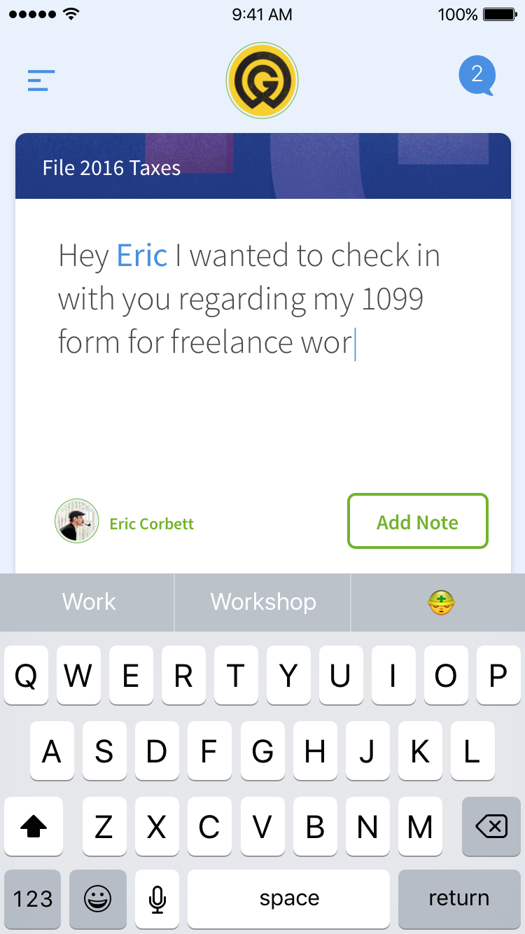
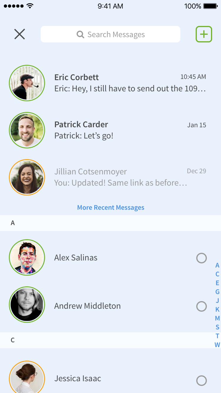
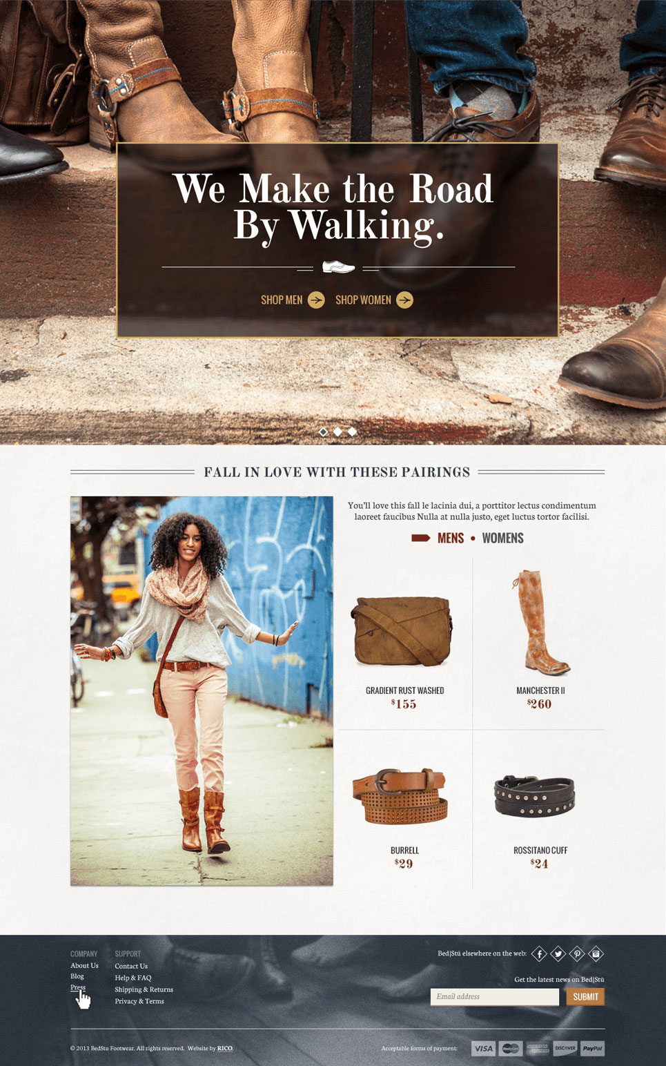
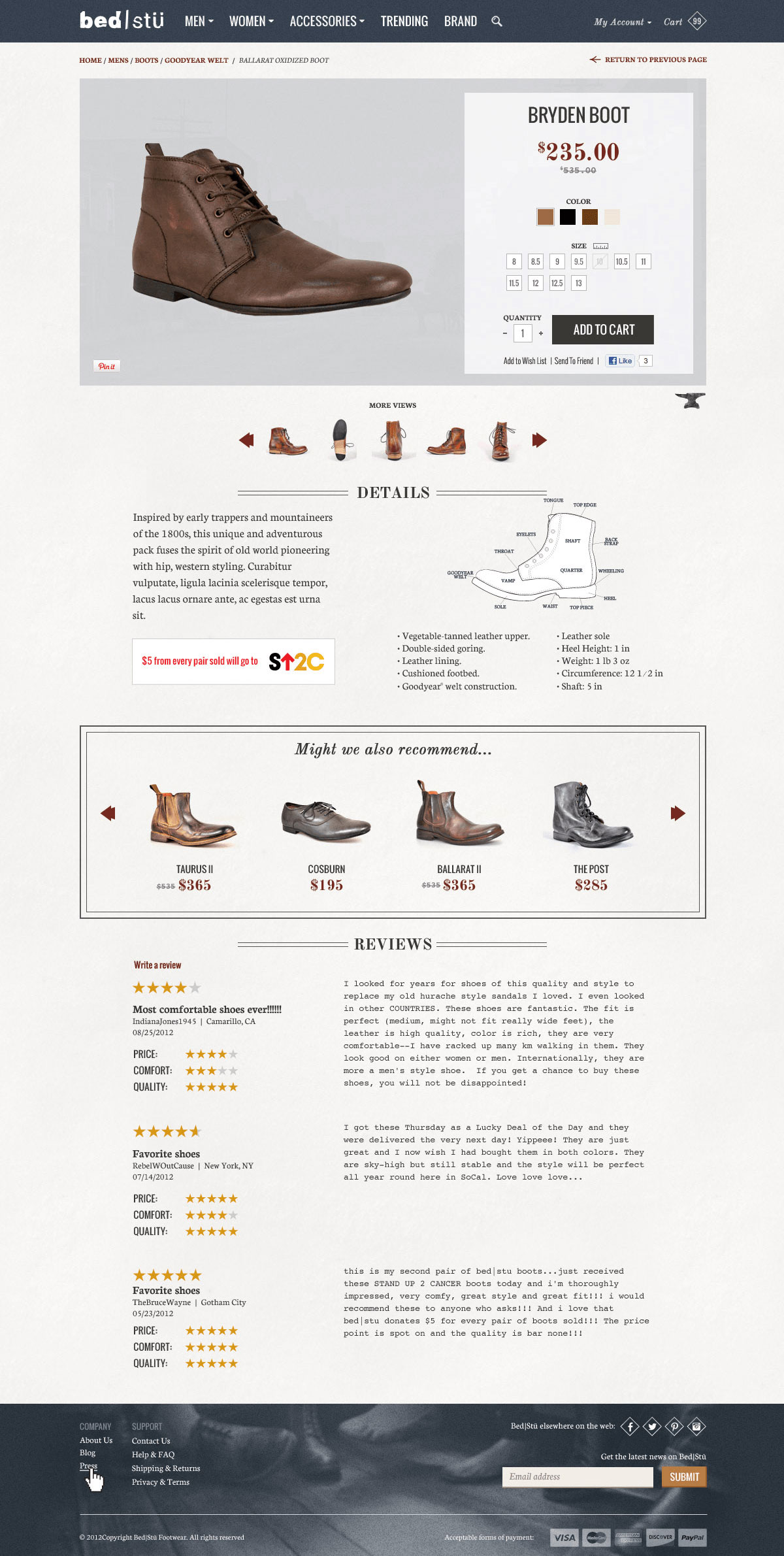
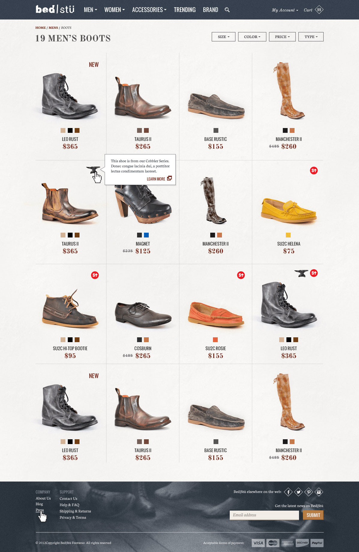
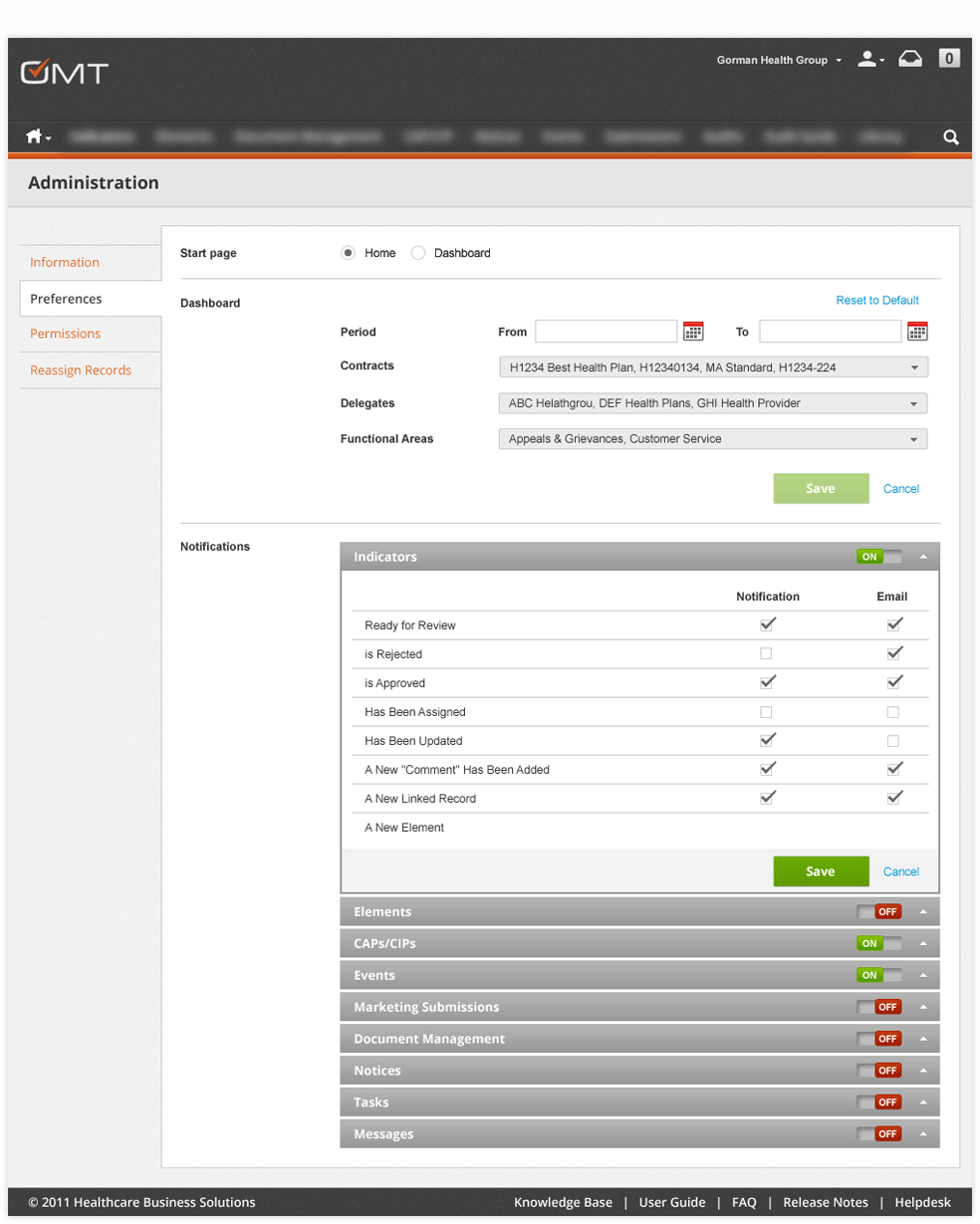
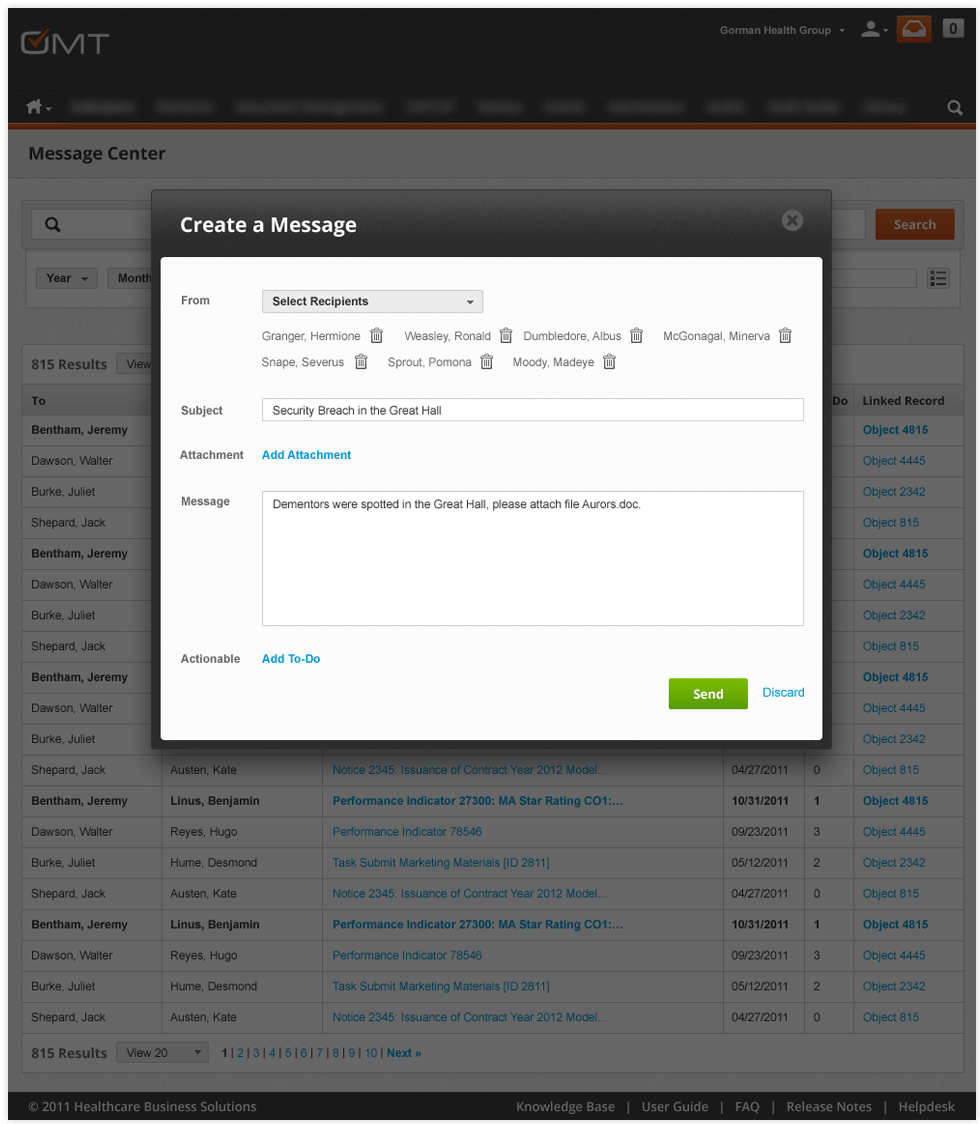
The previous site had little to no customer feedback so we introduced a section dedicated to real life use cases and user testimonials to provide a marketing voice to new users that’s entirely community driven. Although the core system could not change, I worked with the Archipedia team to build a new private note system into the application that allowed users to communicate in teams about new suppliers and products. This made Archipedia a product of daily use and reference allowing its customers to make decisions on products and companies to work with. BedStu shoes came from functional beginnings. Simply starting as a producer for other brands, they worked on honing their craft, and when they found they couldn't exercise their full creative skill they decided to split off and become a brand that was about authentic, quality footwear made the good old fashioned way. Fast forward 17 years and they had become a burgeoning company sold in stores such as Nordstrom and Anthropologie, and although they were loved for the quality of their product, their brand was being poorly represented through their largest channel: their ecommerce store. I provided the design vision for the redesigned ecommerce site, built on magneto. Digging deep into history and roots of the founders I re-imagined the site to represent Bed|Stü’s impeccable quality and aesthetic through bold visuals, an interface that didn't feel like a sterile website, and a user experience that sought to tell pieces of their story on every page. We utilized a series of research methods to gather information about the company, it’s history, it’s founders, and it’s employees to understand the heart of the team and it’s goals for the new site. Over the course of 3 days we met and interviewed everyone from the Founder and CEO, to the shop clerk, to the receptionist to understand their roles in making BedStu function, to what they understood as the vision set out by the company. We compared, contrasted and outlined these findings and presented them to the team. First to understand the components that made the BedStu experience unique, and secondly to identify any gaps in thinking about what and how the brand represented itself through it’s service, customer experience, and overall design capacity. Utilizing the input from the interview process, we set out to identify inspirational components the represented the concepts discussed by the BedStu team. We then assembled 3 different style boards that presented 3 distinct directions that all satisfied the vision of the brand. These were based around concept pillars that defined the desired BedStu experience. After a design concept was selected, we got to work building the story and visual components that would be used throughout the experience, detailing items like voice, style, color, tone, and user interface detail that would create a cohesive user experience for the brand Working with our development team, we designed the interface to support the intended direction BedStu desired the brand to go, and detailed the content and interface components to best present the BedStu products. We focused on creating an experience that was about the product, and the design and templates for sections such as catalog, product, and custom CMS pages sought to tie together historical heritage with their fashion-forward future. We re-imagined the site to represent Bed|Stü’s impeccable quality and aesthetic through bold visuals, seamless function and a fantastic user experience. RICO is a software engineering company that provides proprietary and implementation design and software engineering services for Healthcare, Fashion, and Automotive clients. Notable clients were Honda, Toyota, Macy’s, Sears, Huntington Library, BedStu Footwear, and Taos Footwear. As Director of Design and User Experience, I was responsible for development of concept, content, design, and brand enhancements. Previous to my employment, RICO was strictly a software engineering and development shop with very little design awareness or presence. The RICO site was a signpost for the new standard of design and content that perpetuated throughout the practice for the past 5 years. Being a software engineering agency, there was little time or attention given to design, content, branding, or customer experience initiatives. An updated branding effort was necessary to introduce the design practice and skill set, as well as tie the two services together to be able to support one another. One major objective was that the design of the homepage needed to tell it’s own story, and to give the user a thorough experience of caliber of work, with marked points to dive deeper. To achieve this, the portfolio utilized parallax to add to the visual interest of thumbing through work, and every item of work felt like a feature. The content educated the customer succinctly about the work completed, so as to provide context, but to stay as a summary to give a good overview quickly. I outlined a new design language, content strategy, and portfolio templates to more efficiently and effectively market the projects and culture of the company. Gorman Health Group delivers expert counsel and digital products to government health care firms. I oversaw a complete re-architecture and redesign of their flagship product. I worked with Gorman’s senior staff to understand Medicare compliance regulation and distill the highly complex system into a scalable, user-friendly interface. I led the strategy, architecture, and design for the entire project covering a six-month phase which included presenting to Gorman’s key user group conference of 30 major health plan representatives. Government Medicare Compliance is no walk in the park. From corrective actions, to audits and marketing materials, I had to research along with our design and engineering teams to understand the ins and outs of medicare compliance, as well as work with Gorman to detail and then optimize user workflows, information architectures, and provide a design that would improve efficiency and help create a better experience for over 30 of the 40 major health plans conducting Compliance functions for their insurance companies. The OMT application had been originally created 6 years prior to us re-designing it, so there were eight major modules that consisted of about 600 pages worth of informational content, protocol, and data. We fully immersed ourselves in the data, utilizing an iterative approach to understand, define, design, and prototype each section. We created a design language that consisted of iconography, grid templates, interaction flows, and page layouts that supported each individual module, but share similar traits to help the entire experience feel more ergonomical. From there we prototyped the bulk of the application and it’s data points in Axure, taking time to detail each individual module. We iteratively revised the design with feedback from executive team and user feedback received at their user group meeting.Productivity. Right. On time.
Background
My Role
The Challenge
The Approach
5-Day Sprint 1: Solution Concept Field
5-Day Sprint: Product Definition
Building the Digital Architecture Library for Australia
Background
My Role
The Challenge
The Approach
Architecture
Wireframing
User Interface Design
Honoring The Passion of Craft
Background
My Role
The Approach
Stakeholder Interviews
Design Strategy
Design Brief
User Interface Design
The Solution
A Showcase of Custom Case
Background
My Role
The Challenge
Because Medicare Compliance Needs Design Too.
Background
My Role
The Challenge
The Approach
The Solution

About
I work to make technology products simpler, so they’re more practical and delightful to the people who use them. With a background in Psychology and extensive professional experience in design, technology, and business, I can lead an initiative from inception, to launch, and beyond.
When I’m not working, I’m enjoying life with my inimitable @helloleelo, and my two cubs #teddylpz, & #sammylpz. You can find me uncovering all the spots in the Pacific Northwest, either by ferry or bike.
